How to Photograph Food With a Phone — The Complete Guide to Menu-Ready Shots
How do you photograph food so it actually looks appetising? This guide covers lighting, shooting angles, composition and the phone camera settings that matter — plus the part almost nobody teaches: how to keep a whole menu of dishes looking like one consistent set. No DSLR, no studio, no photography background required.
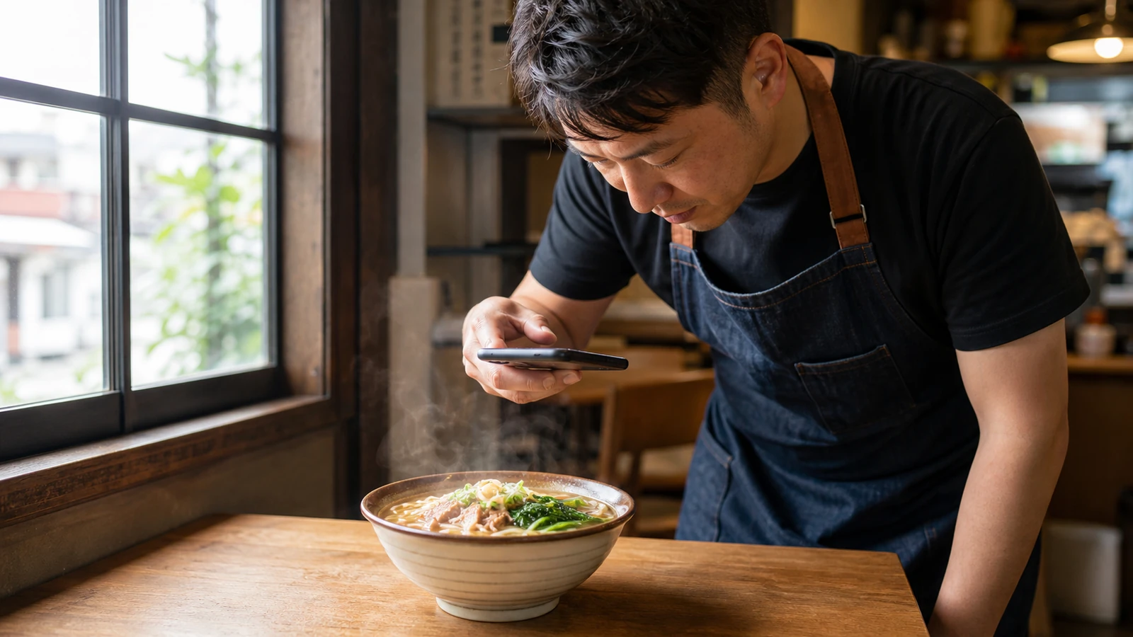
Plenty of restaurant owners assume that menu-worthy food photos require a DSLR and a rented lighting kit. They don't. A good food photo comes down to three things: the right light, the right angle, and a clean background. All three are achievable with the phone already in your pocket.
This guide walks through lighting, angles, composition and camera settings — then covers the part almost nobody teaches, and the part that matters most if you run a restaurant: how to make an entire menu look like one coherent set.
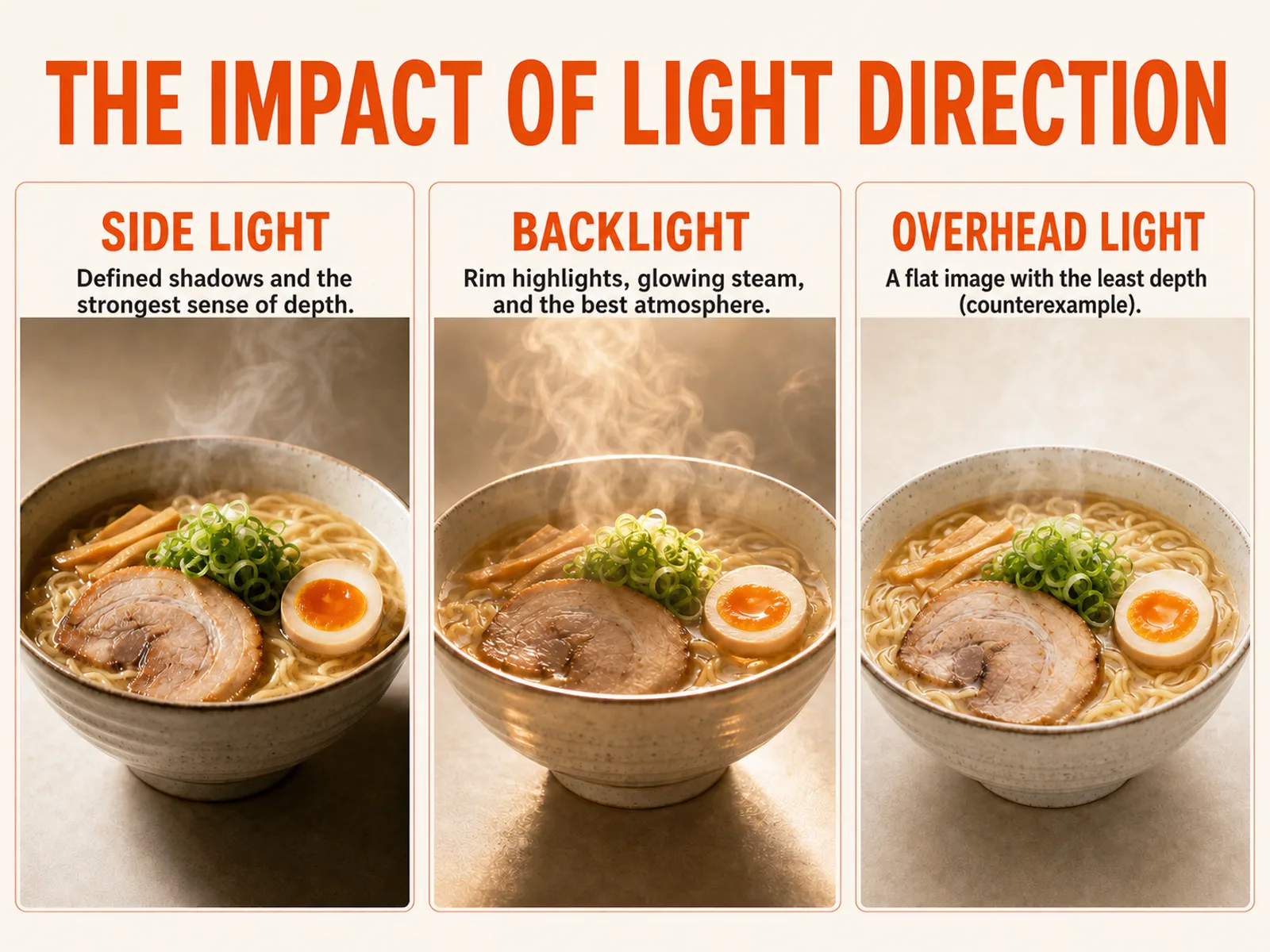 Light direction is what gives food dimension: side light and backlight carve out shape and texture, while flat frontal or overhead light tends to flatten a dish. (AI-generated illustration)
1. Light: find a window, kill the flash
Lighting is the single most important factor in a food photo. Two decisions get you most of the way there:
- Carry the dish to a window and shoot in daylight. Natural light makes food read as bright, fresh and warm. Let the light come from the side or behind the dish — side light and backlight define edges and reveal texture, giving the food dimension. Light striking the food head-on tends to flatten it.
- Turn off your phone's flash. On-camera flash produces harsh shadows in the plate, blows out the food and distorts colour. For food, there is almost no situation where it helps.
What if the restaurant only has warm ceiling lights?
This is the situation most owners actually face: no big windows, just yellow light from above. A few practical moves:
- Get close to a single light source and avoid mixed lighting. The hardest situation to salvage is one frame lit by several colours of light at once — white from a window, yellow from the ceiling, a little blue spill from a phone screen. Pick one dominant source and move close to it; it beats standing in the middle of the mix.
- Whether warm light is atmosphere or a problem depends on what you want. Photographers genuinely disagree about white balance: some argue for correcting toward neutral, others hold that the warm glow of a café or an izakaya is the atmosphere, and forcing it to clinical white looks worse. A workable compromise is to avoid mixed light while shooting, and nudge the colour later in editing.
- Useful background: light around 5000–5500K reads as white, while lower colour temperatures (traditional bulbs) skew yellow and higher ones skew blue. That's why warm restaurant lighting can make white rice look slightly dirty.
Worth noting: overhead light isn't strictly forbidden. Some guides list ceiling light as workable in a restaurant, and it can be — it simply flattens food more easily and drops hard shadows inside the plate. If you can move to side light by a window, it will usually look better.
2. Angle: match the angle to the dish, don't default to 45°
Most guides stop at "45 degrees is safest." That's true but incomplete. The angle should follow the shape of the dish:
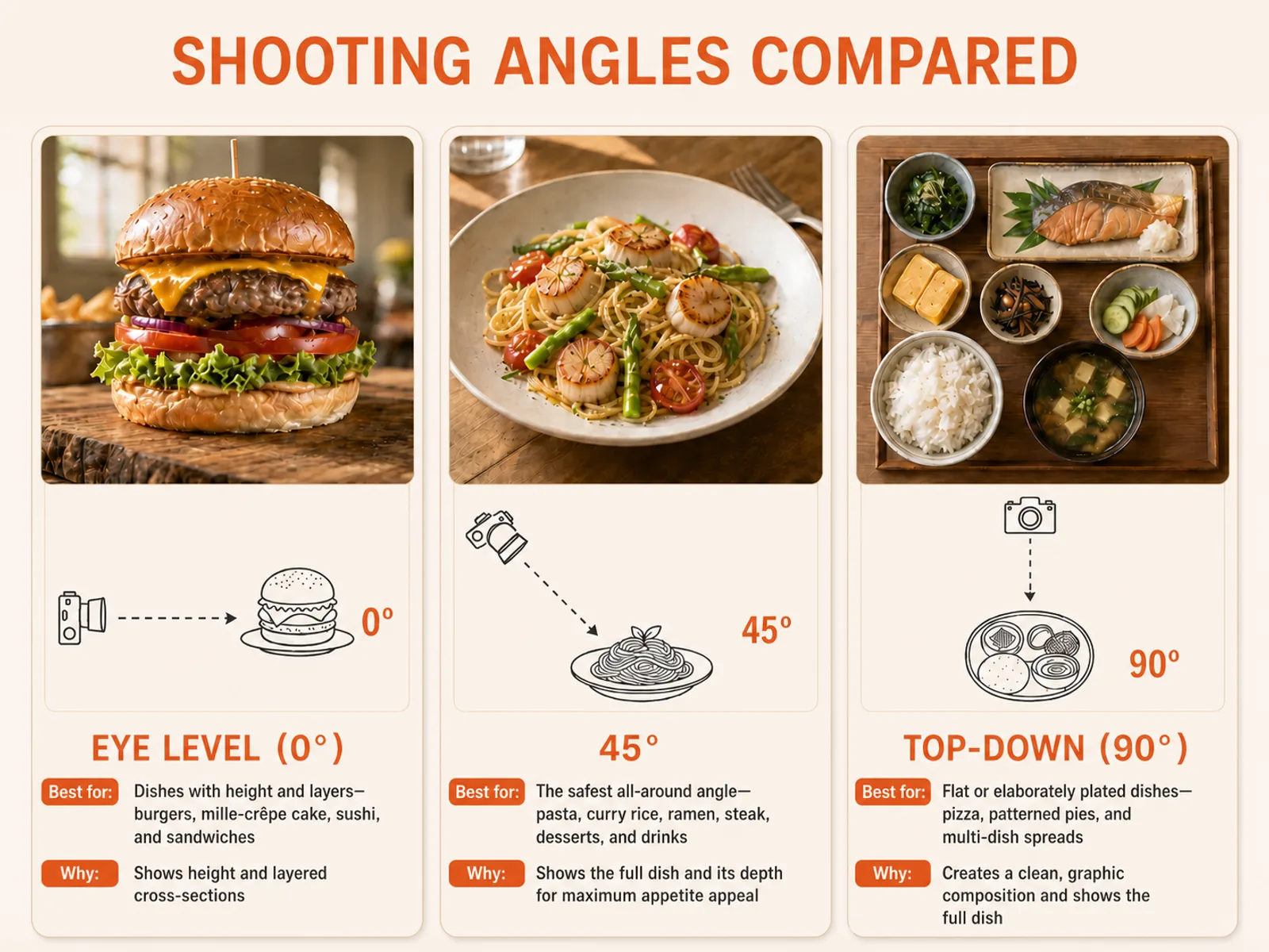 Dish type × angle: stacked and layered food at eye level, flat-lay subjects from directly above, and most everything else at 45°. (AI-generated illustration)
One caution: don't shoot everything top-down. Food with height and layers — a double-layer cake, for instance — loses exactly what makes it interesting when photographed from above. The angle exists to show off a dish's best side, not to follow a formula.
3. Composition: rule of thirds, clean background, breathing room
- Turn on your camera's gridlines and use the rule of thirds. In Settings → Camera → Grid, enable the 3×3 grid and place the subject or its focal point near a grid intersection. It reads better than a rigidly centred frame. (Centring the subject with props fanned around it is equally valid — as a beginner, aim first for a clean, balanced frame.)
- Keep the background clean. Plain white, black or muted surfaces show off the colour and texture of food best. Before you shoot, clear out the napkins, sauce packets, phones and cloths creeping into frame.
- Leave space, and get close. A tight crop with a little negative space emphasises texture; moving the phone closer also produces a shallow depth-of-field effect that separates the subject from the background. Get too close, though, and you'll lose focus — tap the screen to refocus.
4. Get the camera settings right
Most guides stop at "tap to focus." A few more settings will noticeably raise your hit rate:
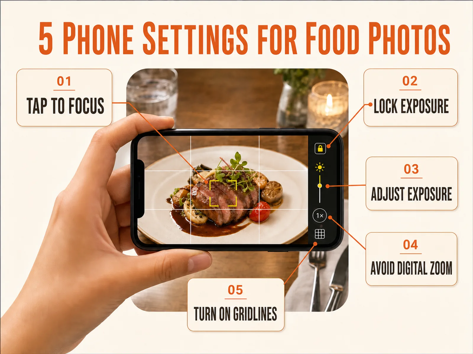 Getting these settings right measurably improves your success rate when shooting food on a phone. (AI-generated illustration)
- Tap to focus, then lock exposure. Tap the subject to focus; on an iPhone, press and hold for a second or two to trigger AE/AF Lock. Once locked, you can recompose without focus and brightness drifting.
- Use the exposure slider to avoid blowing out highlights. After focusing, a small sun icon appears beside the focus box — slide it up or down to adjust brightness. Overexposure (so bright the highlights lose all detail) is the most common beginner mistake; err slightly darker to protect detail.
- Turn off digital zoom. Digital zoom is just a crop-and-enlarge, which softens the image and introduces noise. To get closer, walk closer rather than pinching to zoom.
- Use HDR situationally. HDR captures several exposures and merges them to recover detail in high-contrast scenes. Leave it on for backlit or window-side shots; turn it off when you deliberately want strong, dramatic light and shadow.
5. Styling and a sense of motion
- Props support the dish, they don't compete with it. Cutlery, linens, a sprig of something, scattered ingredients — all exist to frame the hero. Don't let them upstage the food.
- Add a hint of the dish being eaten. A cut revealing a molten centre, a cheese pull, sauce being poured, a drink held in hand — that implied action is what makes a photo feel appetising.
6. The part restaurant owners actually need: making a whole menu match
The five techniques above are findable elsewhere. But if you run a restaurant, the real problem isn't shooting one good photo — it's shooting dozens of dishes and making them look like they belong to one brand. Almost no guide covers this, and it's precisely what separates a menu that looks professional from one that doesn't.
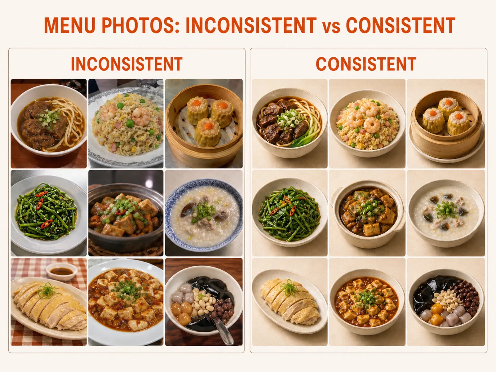 On the left, every shot has different light, angle and background, so the set reads as messy. On the right, a consistent treatment gives the whole menu a brand feel. (AI-generated illustration)
The method is straightforward — decide the rules once, then shoot every dish to them:
- Shoot a reference frame first. Pick a representative dish, dial in the light, angle, background and distance until you're happy, and note the setup. That becomes the standard every other dish follows.
- Fix a single shooting station. Same table, same spot by the window, same background, same angular logic (all at 45°, say). Once the position is fixed, colour temperature and brightness stay consistent on their own.
- Batch during off-peak hours. There's no time to style plates in the middle of service. Shoot the day's dishes together during prep or a quiet stretch, so they share one lighting condition.
Getting dozens of dishes to match by hand is genuinely time-consuming. That's where an AI food photography tool helps — upload the photos you already shot and let AI apply one consistent style across the whole menu, aligning the colour treatment in one pass.
Still not quite good enough? Your next step
You've done everything right — light, angle, settings — and the photo is still a step short. That's normal; a phone has limits. Two paths from here:
- Edit by hand. Apps like Snapseed, VSCO, Foodie and Lightroom let you fine-tune brightness, contrast and white balance (correcting some of that warm ceiling light from section 1). Free, but you're adjusting every photo yourself — which gets exhausting at volume.
- Use AI to enhance your real photos. To be clear about what this means: MenuFactory improves the lighting, background and plating quality of the dish you actually photographed. It doesn't invent a dish that never existed — the food is your food, and what the customer is served is what's in the photo.
Already have phone photos of your dishes and just need that last step? Six free credits let you enhance a real photo with AI and see the result — no reshoot, no waiting on a photographer's calendar.
FAQ
What's the best angle for phone food photography? There isn't a single answer — it depends on the shape of the dish. Stacked, layered food (burgers, cakes) works at eye level; flat subjects (pizza, table spreads) from directly above; most other dishes are safest at 45°. See the dish-type comparison above.
The restaurant is dim and the light is very yellow. What do I do? Carry the dish to a window and use daylight where you can. If you're stuck with warm ceiling light, the key is to avoid mixing several colours of light in one frame — shoot close to a single source and correct the colour cast later in editing.
Should I use flash for food? No. Phone flash creates harsh shadows and washes food out into distorted colour. There is almost no case where it's the right call for food.
Can a phone really produce menu-quality photos without a DSLR or any training? Yes. Get light, angle and a clean frame right and phone results are good enough for menus, delivery platforms and social. If it's still slightly short, editing or AI closes the gap.
What should I edit with, and should HDR be on? Snapseed, Foodie, VSCO and Lightroom are all good starting points. Turn HDR on for backlit or window-side scenes with heavy contrast; turn it off when you want strong, moody light.
Wondering what shooting it yourself, hiring a photographer, or using AI actually costs — and which is worth it? Read the full cost comparison.