AI Photography for Café Menus
A café's drinks menu is thirty listings served in the same cup. The vessel cannot separate them, the platforms require a separate photo for each, and the only variable left is the surface of the drink.
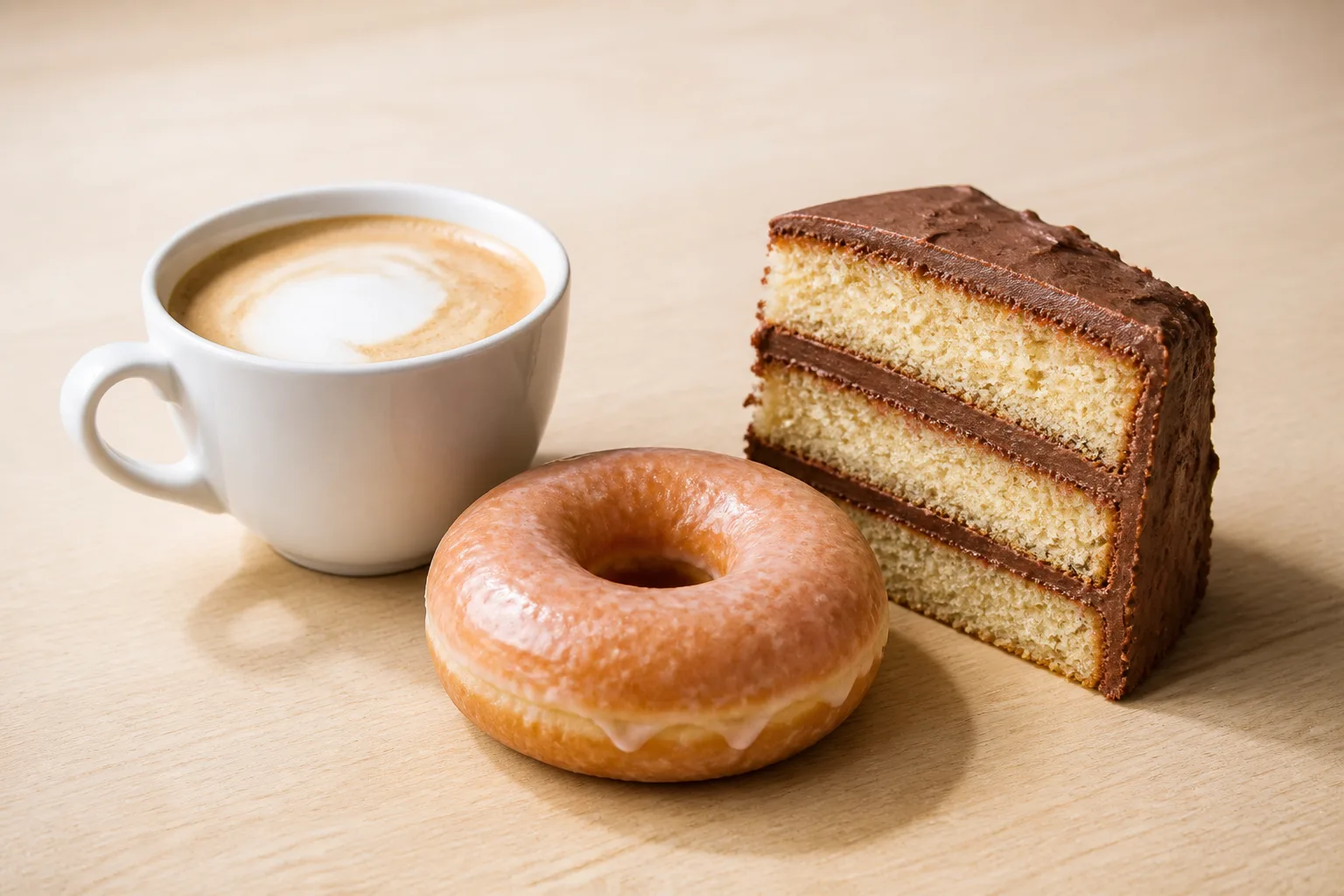
Every other cuisine differentiates its listings by what is on the plate. A café cannot: a latte, a flat white, a cortado and a cappuccino are the same volume of the same two ingredients in the same cup, and the differences that justify four separate listings are largely invisible from outside the vessel.
Thirty drinks, one cup
DoorDash lists duplicates among its eleven named rejection reasons: every unique menu item needs its own photo, and reuse is permitted only for the exact same item — its published example being a Beef Taco and a Chicken Taco, near-identical products requiring separate images. Sources are in our DoorDash photo requirements guide.
For a café this is the whole drinks menu at once, and the honest answer is not to photograph every variant. It is to decide which distinctions are actually visible and to build the photography around those.
Three things genuinely separate one drink from another in a frame:
- The surface. Latte art, crema colour, the boundary between foam and espresso. This is the only reliable differentiator between milk drinks, and it is visible from exactly one angle — directly overhead. The coffee page covers why that angle is also, unusually, the crop-friendly one.
- The vessel, when it genuinely differs. A cortado in a small glass and a latte in a large cup are visibly different products. Use that; do not standardise it away.
- Layering, in iced drinks. Cold brew with milk poured through it has a visible gradient that a flat white does not, and it only reads from the side.
Everything else — a single-origin versus a house blend, one syrup versus another — is a description-level distinction, and asking a photograph to carry it produces thirty near-identical thumbnails and no benefit.
The food case is the other half of the menu
Pastries and layer cakes are stacked, and a stack only reads from the side; the cut face is what proves how many layers you are selling, which is the cake page. Glazed items — donuts, danishes, anything finished with a shine — are curved mirrors that reflect whatever is above them, and at thumbnail size a hard reflection reads as a blown-out patch rather than as gloss. That is the donut page.
The temptation is to photograph these in the display case, because that is where they are. Case lighting is small, hard, coloured and directly overhead — the four properties that damage a glaze the most. Take the item out and shoot it on a plain surface under a large soft source.
The printed cup passes, the watermark does not
DoorDash permits a logo that physically exists on the item — a printed takeaway cup, for instance. Uber Eats bans text, logos and watermarks in item photos and then names the same allowance as an exception: logos and text on the food a merchant sells, or on its packaging or plating, with one added condition, that nothing profane appear.
For a café that settles the default product. Takeaway coffee is served in a printed cup under a printed lid, the print is on the packaging, and a photograph of your actual takeaway product is not disqualified by the words on it. What is disqualified is text that was never in front of the camera: a watermark laid over the file, a shop name typed into a corner, a price badge added in an editor. None of those was ever on the drink, the cup, or the tray it went out on, which is the whole of what the exception covers.
The one difference left is worth deciding before the shoot rather than after an upload. The profanity condition is Uber Eats' alone, so a cup whose slogan is the joke your regulars come for is the single case here where the same photograph can pass on one platform and not the other — and the answer to that is a plain ceramic cup, not a second set of photographs.
Poured art has a very short window
Latte art begins to bleed as soon as it is finished. The crisp boundary between microfoam and crema softens, the pattern spreads, and a defined leaf becomes a smudge. There is no lighting fix and no editing fix once it has moved.
The only workflow that survives it is to have the camera framed, focused and exposed on a stand-in cup before anything is poured, and to shoot the instant the drink is set down. Treat the pour as the last step of the setup, not the first step of the shot.
One setup, and why it should not move
Set the camera overhead on a plain surface with one large soft source, and do not move it. Pour, shoot, replace, repeat. A café is the one menu where a single fixed setup can carry most of the listings — the constraint is the pour window, not the framing, and every minute spent adjusting the camera between drinks is a minute the art is dying in.
See how MenuFactory works — the pour window is the real cost of café photography, and it is the constraint that disappears when the light is decided after the shot rather than during it.