AI Coffee Photography for Delivery Menus
Latte art is only visible from directly overhead, and overhead is the worst angle for a tall cup in a 16:9 frame. Coffee is the dish where the two rules point in opposite directions.
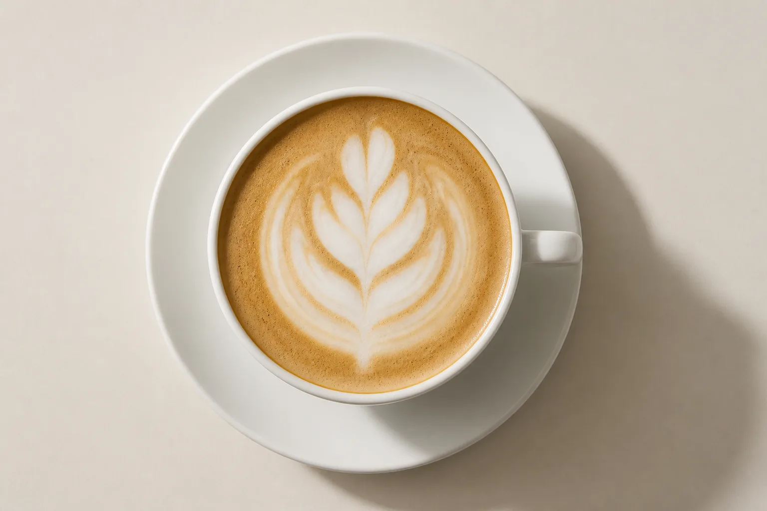
Coffee has a genuine conflict at the centre of it. A tall cup wants a straight-on shot, because that is the only way its height reads. Latte art wants a directly overhead shot, because that is the only angle it exists from. You cannot have both in one frame, and the crop rules make the choice for you differently on each platform.
The two shots, and what each costs
Straight on gives you a tall subject, which is the worst possible fit for DoorDash's mandatory 16:9. Either the cup shrinks until its full height fits, surrendering most of the frame to background, or it fills the height and loses the rim or the base.
Directly overhead turns the cup into a circle — a compact subject that sits perfectly in the square thumbnail and reasonably in every other ratio. It also shows the latte art, which for a café is the product.
For espresso drinks with art, overhead wins on both counts, and this is the rare case where the crop-friendly angle is also the sales angle. For a black coffee or a cold brew with nothing on the surface, overhead gives you a brown circle, and straight-on with its awkward crops is the lesser evil.
What each platform's crop does to an overhead cup
The item specs below are the platforms' own, checked against their published pages on 2026-08-15 (source list in our DoorDash photo requirements guide).
| Platform | Item ratio | What an overhead cup loses |
|---|---|---|
| DoorDash | 16:9 landscape only | Nothing, but the sides of the frame are background |
| DoorDash thumbnail | centre-cropped to 1:1 | Nothing — a circle centred is the ideal square subject |
| Uber Eats | 5:4 to 6:4 | Nothing at 5:4 |
| Grubhub | 4:3 | Nothing |
| Grubhub desktop header | cropped to 4:1 | The rim — the band is a stripe of crema |
The saucer is the variable. A cup on a saucer with a spoon and a biscotti beside it is a wide arrangement that loses its edges in the square crop, and if you sell the biscotti separately it is also two menu items in one photo, which is what the Uber Eats single-item rule bars. The spoon is not a menu item and does not count against it. Cup and saucer alone, centred.
Latte art starts dying the moment it is poured
Poured art starts to bleed the moment it is finished. The crisp boundary between the microfoam and the crema softens, the pattern spreads, and what was a defined leaf becomes a smudge.
There is no lighting fix for this. The only approach that works is to have the camera framed, focused and exposed before the drink is poured, and to shoot the instant it is set down. Treat it as the last step, not the first.
The printed cup passes, and then the platform edits it
The Uber Eats ban on text, logos and watermarks carries an exception for "logos/text on food items the merchant sells or on packaging/plating", and a printed cup under a printed lid is packaging. DoorDash draws the identical line without calling it an exception: logos and text are acceptable there only when they physically exist on the item. A photograph of the cup you actually hand over passes on both, and the only line it can still cross is the "no profanities allowed" that closes Uber's exception.
Passing is not the end of it, and this is where coffee parts company with everything else on a menu. Uber's own FAQ states that once a photo is approved, "we may edit the size, orientation, lighting, and/or color of your photos." Colour is a variable on their side after you have stopped working on the file. For a burger that costs you almost nothing. For coffee it is the product: a flat white, a latte and a cortado are the same white cup shot from the same angle, and what separates them in a thumbnail is the ratio of crema brown to milk white and where the boundary between the two sits.
So put the difference somewhere a colour adjustment cannot flatten it. Shoot into plain white ceramic where the choice is yours, because crema reads against white and vanishes against a dark or heavily printed cup wall. Get the boundary between foam and crema physically sharp in the cup rather than asking the file to carry it. A drink identifiable only by hue is identifiable only by the one variable you handed over at approval. The review states, the three-day clock and the post-approval editing clause are all in our Uber Eats photo requirements guide.
The shot that covers four of the five crops
Shoot one master at 4:3, at least 2400 × 1800 px, directly overhead, plain unprinted ceramic cup centred with even margin, nothing beside it, soft indirect light with no reflection of the source in the crema. The 4:1 header is not achievable from a cup.
See how MenuFactory works — that narrow window between the pour and the smudge is the real cost of café photography, and it is the constraint that disappears when the light is applied after the shot rather than during it.