AI Photography for American Diner Menus
Most cuisines have a shape problem. A diner has the opposite one: pancakes, burgers, fried chicken and milkshakes need four different setups, and a menu shot piecemeal looks like four restaurants.
A Japanese menu has two shapes. A Chinese menu has three and a hundred items inside them. A diner has no dominant shape at all, and that is its actual problem: breakfast, lunch, dinner and the drinks list each want a different angle, and there is no single setup that serves all of them.
Four shapes on one menu, and none of them agrees
Burgers and club sandwiches are stacked, and a stack only reads from the side; shot from above, a burger is a bun. The burger page covers why a compact stacked subject wastes a 16:9 frame and thrives in the square thumbnail.
Fried chicken and hash browns are crisp textured surfaces that need a low raking light, and go flat under the even overhead light that suits almost everything else. That is the fried chicken page.
Coffee, milkshakes and sodas are tall vessels, the worst possible fit for DoorDash's mandatory 16:9 landscape — either the glass shrinks until it fits, surrendering the frame to background, or it fills the height and loses the rim or the base. The coffee page works through the overhead alternative and what it costs.
Pancakes and pies are flat rounds and stacks respectively, and each wants its own treatment again.
The result is that a diner menu photographed dish by dish, whenever the kitchen had a spare moment, ends up looking like a collage from four different restaurants. On a platform that displays your items as a grid, that inconsistency is more damaging than any individual photograph being mediocre.
What has to stay fixed, and what is allowed to change
The way out is to separate the variables that must stay constant from the ones the food genuinely dictates.
Constant across the whole menu: the surface, the background, the colour temperature of the light, and the distance from camera to subject. These are what make a grid of thumbnails read as one restaurant.
Allowed to vary, because the food requires it: the height of the camera, and the position of the light relative to the subject. A burger shot at a low three-quarter and a pancake stack shot slightly higher still look like siblings if everything else held.
This is worth writing down before the first shot, because the temptation during a shoot is exactly the reverse — to keep the camera where it is and move the food, which produces consistent framing and wrong angles.
The plate is not a single item
Uber Eats requires an item photo to show one menu item, and gives the example: a photo for pizza should display only pizza, not pizza and hamburgers. The test is whether the frame holds two things you sell as separate listings, not how many objects sit on the plate. Both Uber Eats and DoorDash permit a logo that physically exists on the item — Uber Eats extends that to packaging and plating, and adds that nothing profane may appear. Grubhub separately bars body parts including hands. Sources for all three are in our DoorDash photo requirements guide.
A burger with fries is the defining diner image and it is two items. So is a breakfast plate of eggs, bacon, toast and potatoes.
For the item photo, shoot the item. If the fries come with it, the description says so. Where this gets genuinely awkward is the breakfast combo, which is a single listing whose entire identity is the assortment — and there the honest answer is that the combo listing is a case where you accept the constraint costs you something, and put the composed plate in your storefront imagery instead.
Four burgers, one visible difference
DoorDash names duplicates among its eleven rejection reasons: every unique menu item needs its own photo, and reuse is permitted only for the exact same item — its example being a Beef Taco and a Chicken Taco. A diner generates the same collision through burger variants: cheeseburger, bacon cheeseburger, mushroom swiss and the double are four stacks whose differences live in a layer that is two millimetres tall in the middle of the sandwich.
Shoot burgers slightly lower than feels natural, so the cross section of the stack faces the camera rather than the top bun, and let the distinguishing layer sit proud enough to be seen. That single change does more for burger listings than any other adjustment.
The three-extremes test
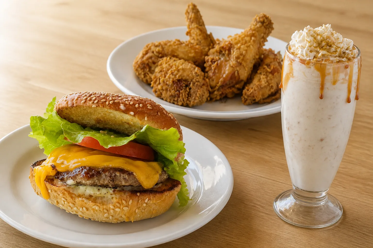
Shoot a burger, a milkshake and a plate of fried chicken in one sitting without changing the surface or the light. Those three are the extremes of the menu. If they look like they came from the same place, the setup will carry everything between them.
See how MenuFactory works — holding one look across a menu this varied is the part that defeats piecemeal shooting, and it is the part that stops being a scheduling problem here.