AI Photography for Ethiopian Restaurant Menus
On an Ethiopian menu the plate is a piece of bread, and it is the same piece of bread under every listing. The repeating part of the frame cannot be cropped away or cleaned up, because removing it removes food.
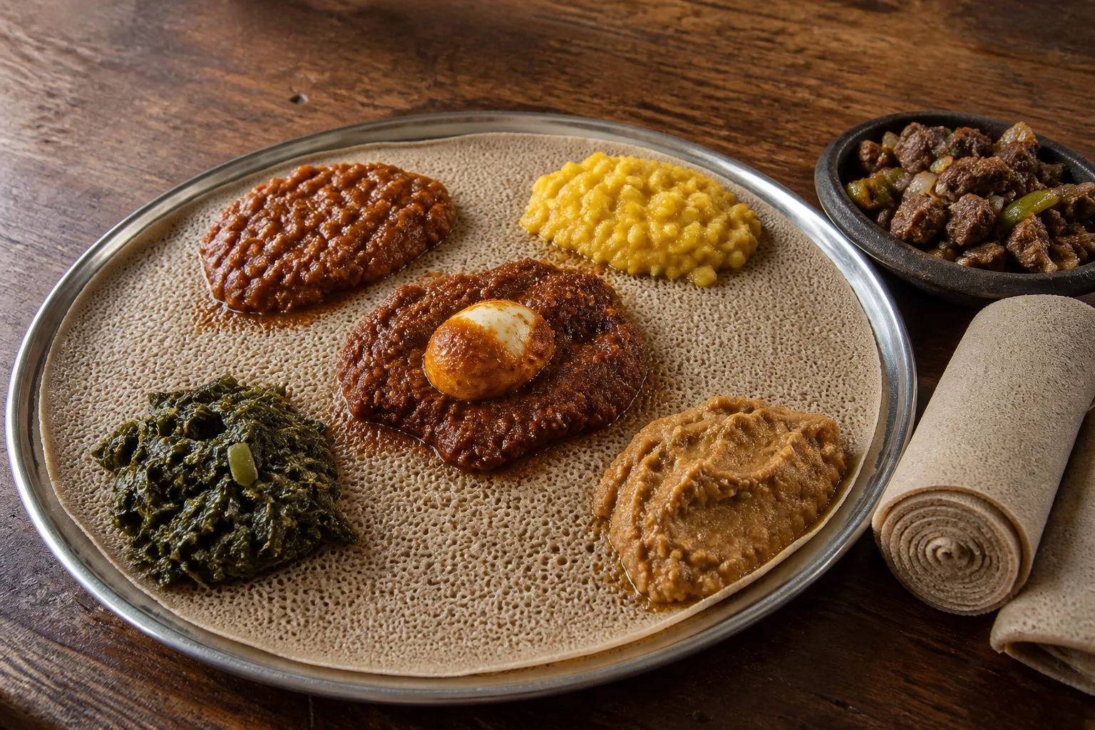
An Ethiopian menu is served on one of its own ingredients. The injera under the food is the plate, part of the dish, and a listing you can order by itself — which removes the assumption every platform photo rule is built on.
Your background is on the menu
On every other cuisine the serving surface is packaging, so a photographer treats it as background and cleans it up: cut the dish out, drop it on white, composite a better table underneath. Our background removal guide covers when that is worth doing and why a cutout alone tends to look like a sticker.
Here it deletes food. Doro wat lifted off its injera is a portion nobody is served, which is DoorDash's misrepresentation reason, and solid colour fills and composited backgrounds are separately named among its eleven rejection reasons — one edit, two ways to fail. The surface is not a fixable layer. It is in the shot, and nothing in post improves it.
The framing rules assume the item has an edge
DoorDash requires the item to fill 50% to 70% of the frame with at least 80% of it visible, and both numbers are measured against something a reviewer can outline. On a beyaynetu the outline is the injera's rim, because the injera is the item — the whole round has to fit, and cropping in on the mounds produces a tighter, better-looking photograph that fails the 80% rule.
The crops then work against that width. DoorDash accepts 16:9 landscape only and centre-crops it to 1:1 for some surfaces; Grubhub crops a 4:3 file to 4:1 for its desktop header. A wide irregular round loses its left and right edges to the first and most of itself to the second. Sources are in our DoorDash photo requirements guide.
The rolled injera sold alongside is the opposite: compact, flat, croppable in any ratio the way a whole pizza is, which the pizza page works through.
The repeating part is under the food, not beside it
DoorDash lists duplicates among those eleven reasons: every unique menu item needs its own photo, and reuse is permitted only for the exact same item — its published example being a Beef Taco and a Chicken Taco.
Most menus answer that with plating: the shared rice or salad goes to the edges the square crop trims, and the middle is given to whatever differs. That answer is not available here. The shared thing is not next to the wot, it is underneath it, it is the largest object in every frame, and it cannot be moved aside because it is holding the food up.
What is left is the mound itself: its footprint, its count, and what its surface does. Misir wat and key wat are both red-brown; gomen and shiro differ less in colour than in edge — chopped leaf against a smooth poured slope. Doro wat carries the only unambiguous marker on the menu, the hard-boiled egg, the brightest object on the plate and the one thing no other listing has.
The plate absorbs, and every edge has a clock on it
A ceramic plate holds a sauce where you put it. Injera drinks it. From the moment a wot is spooned on, its edge softens and a dark wet halo works outward into the bread — and that edge is the only thing separating one listing from the next.
That makes plate-up part of the exposure: light the empty injera first, then spoon on, wettest wot last. If the halos meet, four separately priced listings become one stain at thumbnail size, and no lighting decision recovers them.
Tibs is the only listing that arrives as separate pieces
Tibs, awaze tibs and derek tibs are countable cubes of seared meat in their own small dish. Discrete pieces with real shadow between them are the easiest thing on this menu to shoot, and they satisfy Uber Eats' requirement that an item photo show a single item without argument.
The beyaynetu never does. DoorDash bars a photo of several items sold separately and excepts only what is sold together as a bundle — the ground the BBQ platter page covers. The wots are the hard half, and they are stews: opaque, submerged, dependent on colour a thumbnail barely carries. Angle and colour handling are on the curry page.
Neither overhead nor low
Overhead is the reflex for a flat round, and it is wrong twice over: it flattens every mound into a coloured patch, and it kills the injera's texture, the one thing proving the surface is food and not a mat. Low fails the other way — the near mounds hide the far ones and the bread disappears behind them.
A raised three-quarter holds both. The plane of the injera stays readable, each mound keeps its height, and one low raking side light gives every mound a short shadow on the bread. Every separation on this menu is an edge, and edges only exist under directional light. DoorDash caps a menu item photo at 2 MB and the platforms re-encode what you send; a shadow line survives that pass, while a hue difference between two red stews often does not.
See how MenuFactory works — when the plate is an ingredient, the background is the one thing you cannot edit, and here it never has to be.