AI Curry Photography for Delivery Menus
Curry sells a protein the sauce completely hides. That makes it the one dish where the photograph has to prove what is in the bowl, without breaking DoorDash's misrepresentation rule.
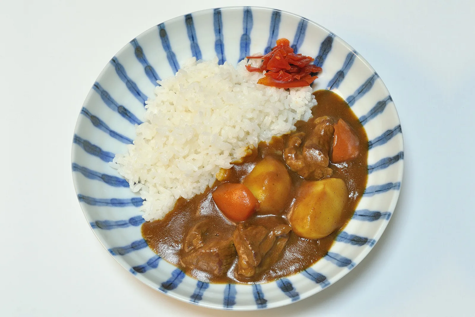
Every other dish on a menu shows you what you are buying. Curry does not. The sauce is opaque, the protein is submerged, and the photograph has to make a claim the image cannot itself demonstrate. That is a harder brief than any crop rule.
What each platform's crop does to a curry bowl
The item specs below are the platforms' own, checked against their published pages on 2026-08-15 (source list in our DoorDash photo requirements guide).
| Platform | Item ratio | What a curry loses |
|---|---|---|
| DoorDash | 16:9 landscape only | Nothing, but the sides of the frame are background |
| DoorDash thumbnail | centre-cropped to 1:1 | The rice, if it is plated beside the bowl rather than behind it |
| Uber Eats | 5:4 to 6:4 | Nothing at 5:4 |
| Grubhub | 4:3 | Nothing |
| Grubhub desktop header | cropped to 4:1 | The rim and everything below it |
The one crop decision that matters here is where the rice goes. Curry and rice plated side by side is a wide arrangement, and the square thumbnail will cut the rice off — leaving a bowl of brown sauce as the image a customer scrolls past. Plate the rice behind and slightly overlapping instead, so the pair reads as one compact subject that survives the 1:1.
Lifting the protein is the honest version of the shot
The instinct is to arrange a few pieces of chicken on top of the sauce so the customer can see them. Whether that is legitimate depends on one thing: whether that is how the dish arrives.
DoorDash's rules include a misrepresentation clause — the image has to show the dish your kitchen actually sends out. A curry that arrives fully stirred, photographed with six pieces of chicken artfully surfaced, is overstating the portion in exactly the way the rule is about.
The version that holds up: plate a real portion, then let the pieces that naturally break the surface break the surface. Do not add. If a real portion shows almost nothing, that is information about the dish, not about the photograph.
Colour is where curry photographs go wrong
Curry occupies a narrow band of oranges, browns and yellows, and it is the food most sensitive to the colour temperature of the light. Under warm light a golden korma turns muddy orange; under cool light a rich red goes brown.
This matters more for curry than for other dishes because the platforms show your image directly beside competitors' images of the same dish, at thumbnail size, where colour is close to the only differentiating signal left. A curry that reads brown next to a curry that reads gold loses on a distinction that is purely photographic.
Shoot under neutral, indirect light and check the sauce against the actual bowl rather than against the screen.
Texture is the second signal
A thin sauce and a thick sauce look the same from above and completely different at a three-quarter angle, where the sauce's surface catches a highlight and its edge against the bowl shows how it sits. A visible surface sheen and a slow, thick edge is what reads as a curry that was cooked down rather than thinned out.
The shot that covers four of the five crops
Shoot one master at 4:3, at least 2400 × 1800 px, three-quarter angle, rice behind the bowl rather than beside it, neutral light, a real portion. The 4:1 header is not achievable from a bowl.
See how MenuFactory works — it improves lighting and colour while leaving the dish itself untouched, which on curry is the only change that is both useful and honest.