AI Photography for Korean Restaurant Menus
Banchan is what a Korean table looks like, and the single-item rule is not what keeps it out of an item photo — the framing and fill rules are. The most recognisable image of this cuisine is still the one you cannot upload.
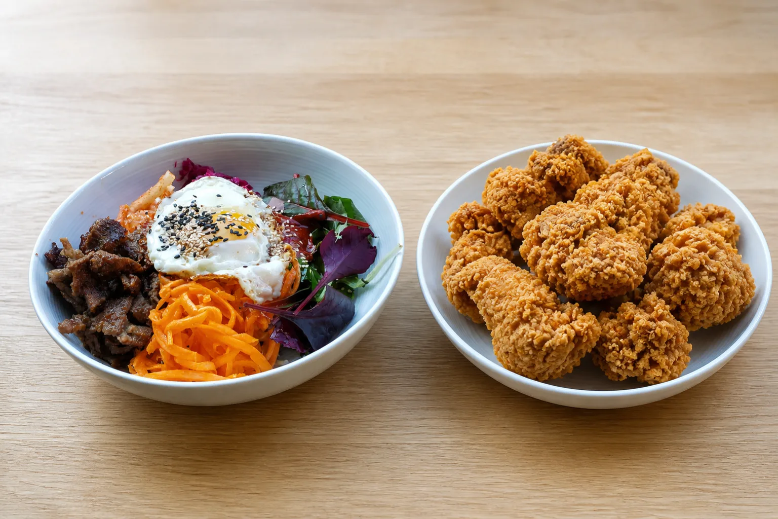
The signature image of Korean food is a table covered in small dishes. That image is also, as an item photo, non-compliant on more than one of the three major platforms — and the gap between how this cuisine presents itself and what a menu photo is allowed to be is the first thing worth resolving.
The banchan problem, stated exactly
The rule this cuisine usually gets cited against is the wrong one. Uber Eats bars an item photo containing "more than 1 single item", and its published example is a pizza photo that also contains hamburgers — it governs mixing different menu items, not how many objects sit in the frame. Banchan is not ordered and not priced; it arrives with the meal, so a bibimbap ringed by six small dishes is one listing and its accompaniments. Sources for all three platforms are in our DoorDash photo requirements guide.
What does rule that picture out is the framing. Uber Eats requires the item to be framed in the centre, with items not appearing at the corners or off frame, and a table laid as it is served puts dishes in every corner and runs the outer ones off the edge. DoorDash asks for at least 80% of the item to be visible and for it to fill 50% to 70% of the frame, and a bibimbap surrounded by six dishes is nowhere near half the picture. A KBBQ set photographed as it is served fails the same way. The most honest, most recognisable picture of what a customer receives is the one the guidelines rule out.
There is no framing trick that resolves this: the frame that satisfies both rules is the one with the banchan outside it. What works is separating the two jobs: the item photo shows the item, and the banchan lives in the listing description and in your storefront's header or gallery images, where the item-photo framing rules do not apply in the same way. A customer scrolling a list is deciding between one dish and another dish; that is the decision the item photo has to serve.
The header is where this cuisine gets its picture back, and Grubhub is the platform whose header shape suits it best. Grubhub takes a header at 4:3 and at least 2400 × 1800 px, then crops it horizontally to 4:1 on desktop web. A 4:1 band is the crop that destroys most dishes, because a plate is round and a band is not. A table of small dishes laid out in a row is the one subject built for it: the band lands across the spread rather than cutting into a single subject, and the dishes that fall outside it were repeats of the ones inside. Compose the banchan shot for the 4:1 first and the 4:3 submission takes care of itself.
Three shapes, and the one that carries the cuisine
Rice bowls — bibimbap, deopbap — are compact, sectioned, and shot from overhead, which is the one angle where the sections stay legible. That is the same construction and the same crop behaviour worked through on the poke bowl page.
Small pieces — kimbap, mandu, tteokbokki — are the scattered-multiple case, where a square thumbnail crops the outer pieces and changes how many the customer sees. The blocking fix is on the sushi page, and kimbap in particular behaves identically.
Korean fried chicken is the one that has to carry the menu, and it is the hardest of the three. It is a crisp textured surface under a wet glossy sauce, which means it has both problems at once: the texture wants raking side light to stay legible, and the sauce reflects any hard source as a blown-out patch. The fried chicken page covers the texture half.
Sauce gloss versus crust texture
This tension is specific enough to Korean fried chicken to be worth stating on its own. Bare fried chicken wants a hard-ish raking light to make its craggy surface read. Glazed chicken — yangnyeom, soy garlic — wants a large soft source so the wet surface produces a long gradual highlight instead of a hard white dot.
Sauced chicken is both surfaces at once, and the sauce wins if you light for texture. The workable setting is a large soft source placed low and to one side: soft enough that the glaze produces a gradient rather than a dot, low enough that the crust still casts small shadows across itself.
If your menu sells both bare and sauced versions as separate listings, they are separate lighting problems, and shooting them under one identical setup is what produces the flat, plasticky look that sauced chicken photographs so often have.
Four glazes, one fried chicken
DoorDash names duplicates among its eleven rejection reasons: every unique menu item needs its own photo, and reuse is permitted only for the exact same item, its example being a Beef Taco and a Chicken Taco.
For Korean menus this concentrates on the sauce matrix. Soy garlic, yangnyeom, honey butter and half-and-half are four listings of the same fried chicken under four glazes, and glaze colour at thumbnail size is a narrow range of red-browns.
Make the glaze the subject rather than an incidental coating: enough sauce that the colour reads, plated so the most heavily coated pieces face the camera, and identical framing between the four so the only thing that changes between the thumbnails is the thing that actually differs.
Shoot the hardest thing first
Shoot your best-selling sauced chicken first, because it is the hardest lighting problem on the menu. A setup that keeps both the glaze and the crust legible will handle the bowls and the small plates without adjustment. A setup arrived at by shooting bowls first will not survive the chicken.
See how MenuFactory works — the soft-but-low source that holds glaze and crust together is the setup most kitchens have nowhere to build, and the one this supplies by default.